TheNameBrand: A History of My Own Personal Projects
Definitely not all of my personal projects, but those that have been most impactful in the last few years
Always tinkering with logos...
Since I was a really young kid, I’ve always been fascinated with branding, logos, how people signed their name, color theming and the like. So I’ve always been tinkering with my own branding, and my own logos. It didn’t just come to me in a day, no. I’ve gone through so many different logo iterations… If you’re interested in the history of it all, keep scrolling back through time to see how it all evolved and began!
2021 Iteration
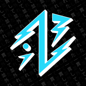
What spawned me to continue to change and improve from the last design iteration, was I had been thinking a lot about icons… And how much more impactful a logo is if it can be recognized at a smaller scale. So I went back and tweaked the design so that it would be a bit more recognizable if it was smaller.
Something the last iteration struggled with was fitting completely within a circle, and looking like the “weight” of it was evenly distributed, and well centered within a circle, so I changed that as well.
Also an improvement was the two toned color structure, placing a thick solid “shadow” gives it much more of a professional appearance in my opinion. It also paves the way for me to create inverted versions of the icon that I am able to use across other websites, and still maintain my branding. For my big push to other social mediums, I created icons using the iconic colors of that branding on an inverted background (with one exception).
I changed the Japanese to 「一貫して並外れた」which translated means “Consistently Extraordinary”. Which I thought had a lot more meaning to it than just “Name Brand”, which is what it was in the previous iteration.
The last change is I created some images using just the “TheNameBrand” text from before in a similar style to the logo. I also have some inverted versions, and alternative colored versions to fit the social media site they’re living on.
For the foreseeable future, I’m not sure the branding will change. I’m super content with it. The only thing I might try squeezing in the future is some kind of glitch/static/RGB/ASCII influence, because I really really enjoy that aesthetic, and what it brings to design.
2020 Version
I had a ton of inspiration in 2020 as far as my logo creation went!
The process behind the graphic/symbol/logo/icon? I’ve always been a sucker for “electricity” or “lightning”. That probably stems from my early adoption of Pokemon yellow when I was a young young kid. But, nonetheless, the lightning bolt has been something I’ve worked into so many projects of mine. It even has a place in my signature. You can kind of tell, that there’s a “T”, “N”, and “B” in there. Uh, maybe if you squint. You could argue that I guess there’s an “i” in there, but I just put that dot there to fill some more blank space and add a geometric shape that wasn’t so pointy. I also thought it resembled a little cartoon person, or it could represent me or something.
The lettering/font and such came from an idea I had to incorporate the negative space, or the line through the text from the old TRON logo, and the font came from a previous project I did on TheNameBrand branding. Beneath that are some Japanese characters that read 「ネームブランド」, or “Name Brand” (Nemu Burando). I’m really fond of and have a huge respect for Japanese culture, and have been learning Japanese in my own time. If I ever sold branded merchandise, the Japanese characters would be a must. I really enjoy their aesthetic on just about anything.
The electric/neon logo render is something that I threw together in after effects using a free plugin that helps creators make lightning and neon and all sorts of stuff following a mask path, so I imported the “flat” file into there and tweaked all of the lighting to look really interesting. I used it as a little introduction type video for a few of my YouTube videos.
Abstract and "Cult-like" inspiration
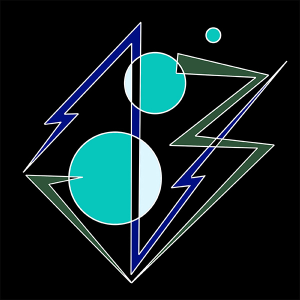
This is the design that I made right before the above. I was watching a bunch of Rusty Cage videos on YouTube and I really liked his logo graphic. It’s clean, and effective. I can clearly tell it was heavily inspired by occult symbols, a few of which are present in the design. So, I took to the net and got a bit of inspiration from occult symbols and this is where I got with it. TheNameBrand… occult edition I guess, haha.
I really like how it turned out! And honestly I could see it being something I come back to (again, the whole merchandising thing this would have to be a design), but I didn’t use it because the graphic has really thin connecting lines, and it doesn’t show up very well in online profile picture circles. Too small! So I beefed it up and threw a spin on it.

Glitches, Static, and Skateboarding?
Before the previous design I had worked on this simpler “TNB” graphic. I’m really fascinated with the “glitch” genre, so there’s plenty of interesting color underlays and a static background to boot. I love especially how the inverted background turned out, it reminds me of something I might find at a skate shop on the wall (ah the merchandising opportunities fill my head once again). As much as I liked the design, I thought it was too basic for me. In reality, I had just meshed some letters together. I knew I could do better. The “TNB” was more or less absorbed into future projects, though much more heavily stylized and not nearly as recognizable as letters at that point.
The other thing the “TNB” allowed, was for me to use it on multiple websites where I’ve gone by a different username with the same initials…
Alternative Branding
Like Twitch.TV for example! Because my typical username was taken, I opted to go by my then twitter handle, NoirBrand. While it wasn’t “TheNoirBrand”, I still opted to use the above as a profile picture. At any rate, I didn’t spend too much time on the art for the channel. However, the font ROBO is something that’s stuck around. I also used Lazenby Computer for the subtitle text. Though simple and just text, I kind of enjoy the simplicity. The boldness of the thick strokes on the letters. It’s nice.
I also made an animated introductory sequence that I played right before segments of my show, as well as during outros and some transitions. I followed a guide from YouTube to get it all right, and did it all right in premiere. I didn’t quite want to get into After Effects (though I have taken quite the deep dive since), but the overall result is pretty good. I think it might have benefitted from the black stroke that I added later on with the flat images. But, lately I’ve decided to bite the bullet and change the channel name over from NOIRBRAND to “TheNameBrand_” to further identify and claim my branding. Just waiting for “TheNameBrand” to become available…
The whole idea of the static and everything actually spawned right from a graphic that I made for my twitter background heading that you can find below.

Other Ideas and Content Creation
Predating much much further back, I had this idea that largely hinged on YouTube… Doing a reverse nametag. So, for example, if I was talking about gaming, the video would be by “VideoGameBrand”, if it was an opinion piece it would be “OpinionBrand”, etc. And I thought up a lot of different other ones and was enamored with the idea for quite awhile, but it dawned on me that the more I diversified the name of my brand, the harder it would be for me to be recognizable, both by viewers as well as the YouTube algorithm. So I knew I had to come up with something different.
Sort of the Beginning
Now, here’s more or less the beginning of the string for these projects… A little image I made with the help of a tutorial, that I used as my Twitter banner for quite some time.
I knew that I wanted something that had that retro VHS feel to it, with a nice little touch of glitch to make it nice and interesting. And from there it planted a little small seed that rippled through many of the following projects…

