Exhibit 04
Placing a complex subject in a new location
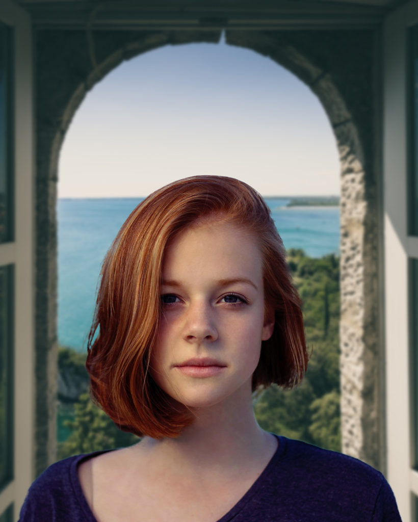
The final image
Photoshop Design
For this project, I was challenged to take this woman and convincingly place her into a new scene. I originally thought I might go for a futuristic feel, and have her reflection on the inside of a window, but I couldn’t find an image with the right permissions (so it’s something I might do in the future). So I went with this background of a place in Italy. I think it turned out quite nicely.
Contrast: I really wanted a striking background that had a lot of color variation and conveyed a sense of story, both of which I thought the original lacked by it’s excessive use of blurring. This image fit nicely into what I wanted and I believe the subject contrasts against the background beautifully.
Repetition: I kept the original photos idea of blurring the background, with the focus on the subject in the foreground. So the blurring is repetitious. I didn’t completely blur out the background though. I wanted a sense of adventure to peek through.
Alignment: I originally wanted to put the subjects eyes at the top of the rule of thirds, but she doesn’t have enough body to work with in that regard. So I opted instead to crop the photo from Italy to a 4×5 ratio, and then place the subject between the archway. The bottom rule of thirds line lines up right above her lips, but I think how she’s placed against the arch is more important to the structure of the photo. The other thing I considered was where the light was coming from in both images, which is why I opted to flip the image of the subject on the vertical to make it feel more in place with the suns rays in the background.
Proximity: I wanted to convey the sense that the viewer was close to the subject, and further away from the background to create a natural sense of depth. I wanted it to feel very interpersonal, almost as if the viewer had gone on a romantic vacation with this woman, taken out their phone, and snapped the photo in portrait mode. For this reason, I have left the image untouched by additional text that would distract the eye.
Color: I wanted the background to be especially vibrant, which is one of the reasons I selected the image from Italy to begin with. I also did some alterations with the woman. I found her hair color to be striking, and wanted to preserve that with the final image. I used levels and curves to tweak the colors of her to better match the colors that are present in the background image, and it leaves the woman colored in a more natural feeling way.
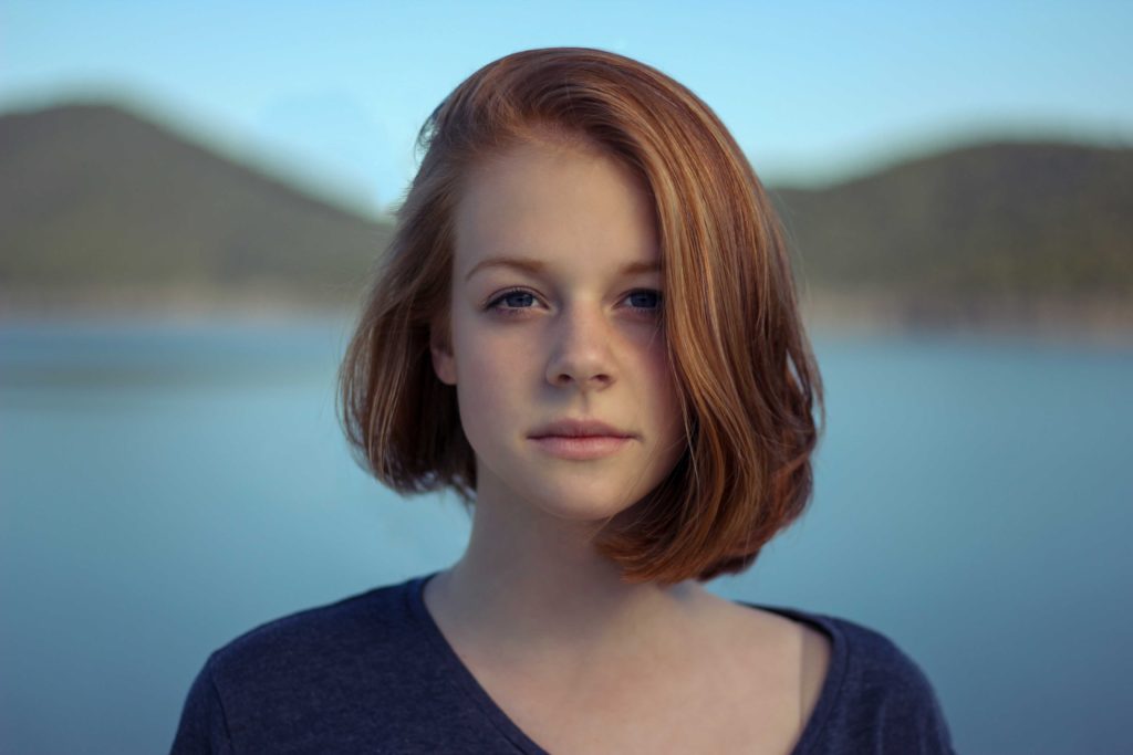
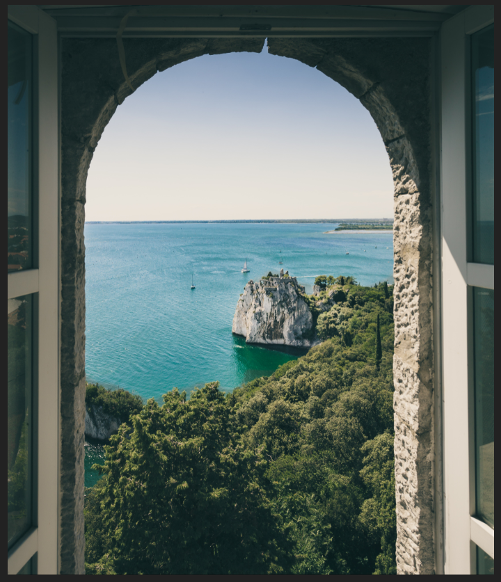
Original image of the subject (top), Original background image (right)
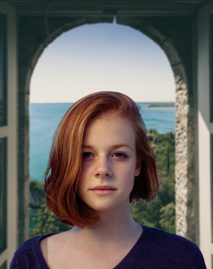
Revisions
Some of my peers thought photoshops neural network could do a better job at selecting the hair as compared to what I have above. Here’s what that turned out to look like. Can you spot the difference?
While I think the neural network does a good job, and catches some things I miss, I also thing it has some drawbacks in what it decides is and is not hair, which ends up creating a weird feathered border around some parts of the subject. But that’s just me! Maybe it looks more natural with it and I’m blind. You be the judge.
Credits
Background image from Jacob Morch on Pexels