Exhibit 10
Business Card Concept

Front

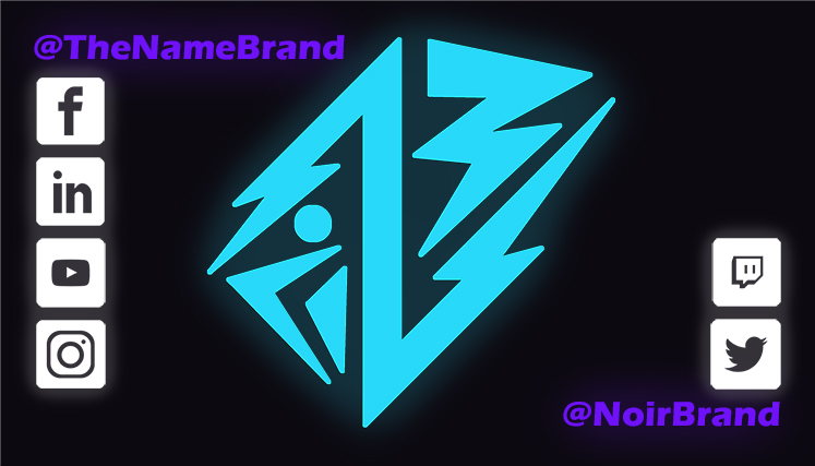
Back
Photoshop thought process
After seeing so many examples of business cards in other students exhibits, I thought I would take a stab at it! I recently revamped my personal logo for my personal brand, so I thought I would see how far I could go with that.
Contrast: I wanted the words and such to have contrast against the background. The main thing was that I wanted to make sure that it would be easily readable, even from further away, even when it’s going to be printed small.
Repetition: I really wanted to keep the colors consistent with what I had envisioned for the brand, with the only new inclusion here being white. The outer glow is also something that’s consistent everywhere except the text on the front (I thought that might make it harder to read so I didn’t include it.
Alignment: I kept things pretty basic… actually, I guess it’s not that basic? Most things are aligned to the left, with some things being aligned on the right to create a little dichotomy. The back being aligned to the left and right have a function, on the left side of the card, my username is @TheNameBrand, and that’s how you can find me on those sites, but on the right, those sites I have the username @NoirBrand (ug, and it’s killing me that it’s just those two!).
Proximity: Kind of like I just mentioned in alignment, the icons on the back are related to the text they’re closest to, so that you can interpret that that’s my username on those sites, and that’s my username on these sites… sort of thing.
Font: I used Eras Bold ITC on the back, and Aktiv Grotesk CD for the rest. Might consider making the latter, all of the font. We’ll see what I get in feedback.
Color: Back when I designed this logo, I knew I wanted the main color to be that cyan, with the secondary being the purple, and red as a light accent color. Which by the by, the Japanese is “Become Original” (a play on my personal branding of “The Name Brand”)
Credits
Fonts used: Eras Bold ITC, Aktiv Grotsk CD. Social media icons I pulled from uxwing.com, a free icon site.
