Exhibit 03
Professional Instagram Ad
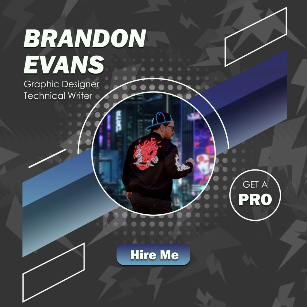
Photoshop Design
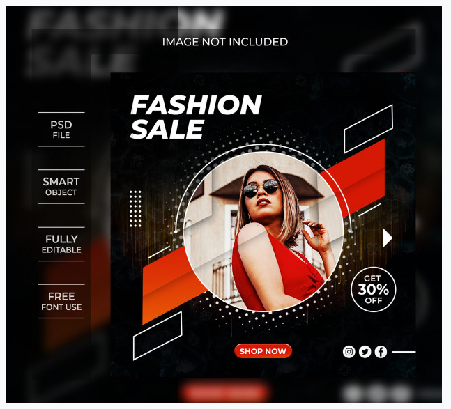
For this Exhibit, I challenged myself to make a similar looking advertisement as this image from freepik.com. While their ad focuses on a fashion sale, I thought I might make an ad for… me, because I’ve been doing a lot of job searching lately. The only major difference is it doesn’t have that yellow noise (though I do have a light gray noise), and I left out the social media buttons in place of my website because that’s where my huge portfolio is going to live. So, let’s break down the design:
Contrast: I decided to go with a blue and gray color scheme, with some nice white accents to grab your eyes to the text and all the interesting lines and shapes.
Repetition: For repetition, I created the dot pattern by using the color halftone filter on a single large soft black dot. Then I did a radial gradient on a mask layer to get that nice “fading into obscurity” look. I also had to use the divide layer style to get it to be white and transparent. I created a custom brush present using the lightning bolt shape I made, and increased the scatter, rotation, size, and color jitter to get a nice random pattern that I plastered across the background. Then I just reduced the opacity. The rhombus’s (rhombi?) are all created from the same parent rhombus that I copy and pasted 5 times.
Alignment: I aligned the elements, first by using guides to create a pseudo-margin (which is only broken by the top and bottom rhombus), and from there, I brought in some more guides to figure out a nice center for my profile image. After that, all the elements were aligned to those guides.
Proximity: I made sure to keep all the elements relatively close together so that nothing seemed to be out of place or unrelated. The really noticable shapes are also kept in close proximity for similar reasons.
Font: I wanted a bold, italic, and sans-serif font, to try and match the original ad as much as possible. I also thought it would look the most professional, to have a sharp looking text, which is why I ended up on using Franklin Gothic Heavy. For the thin “GET A” text, I wanted something similar looking, just skinny, since Franklin was more or less permanently bold. My search led me to Century Gothic, which I think matches quite nicely.
Colors: Like I mentioned earlier, I wanted to use some of my favorite colors, so I decided to go for dark and light blues, as well as dark and light grays, with a nice white as a good middle ground/accent color.
Revisions
My classmates wanted me to put some kind of title in my name so that all my information was on the graphic, so I did that. I also changed the center image to one of me with better lighting.
Credits
Fonts: Franklin Gothic Heavy, Century Gothic. Inspiration image: https://www.freepik.com/premium-psd/fashion-sale-banner-template-instagram-post_8660047.htm