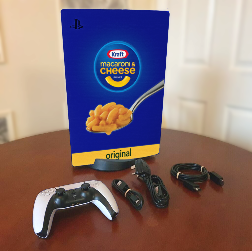
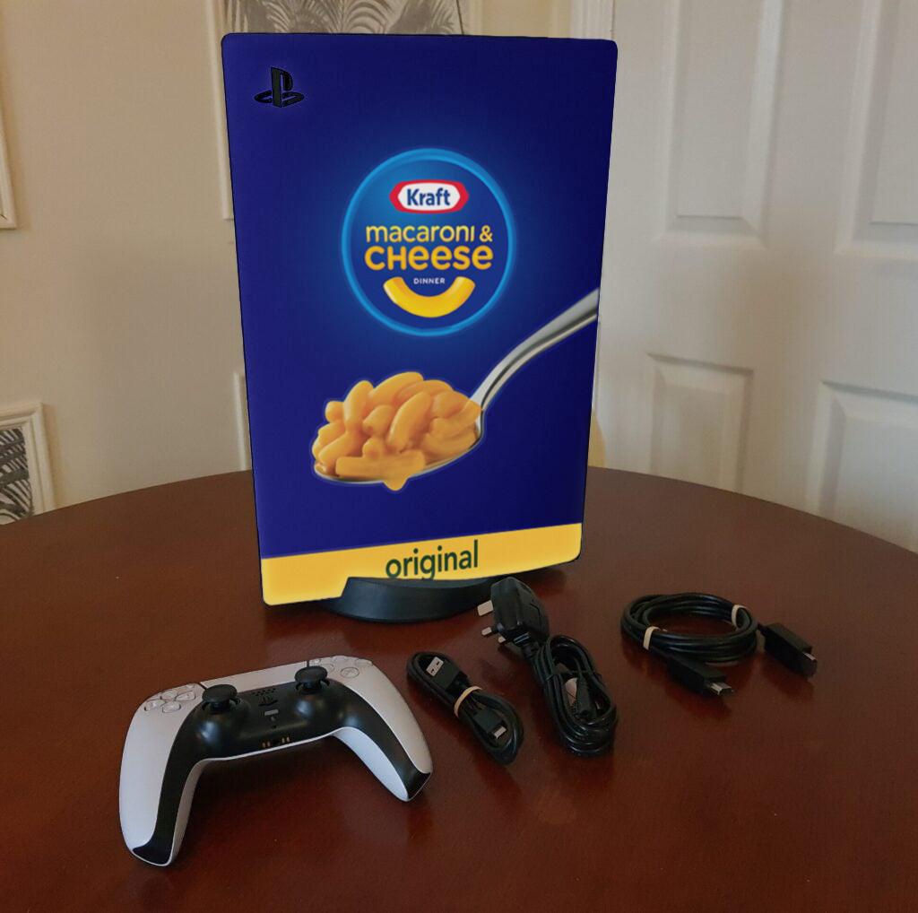
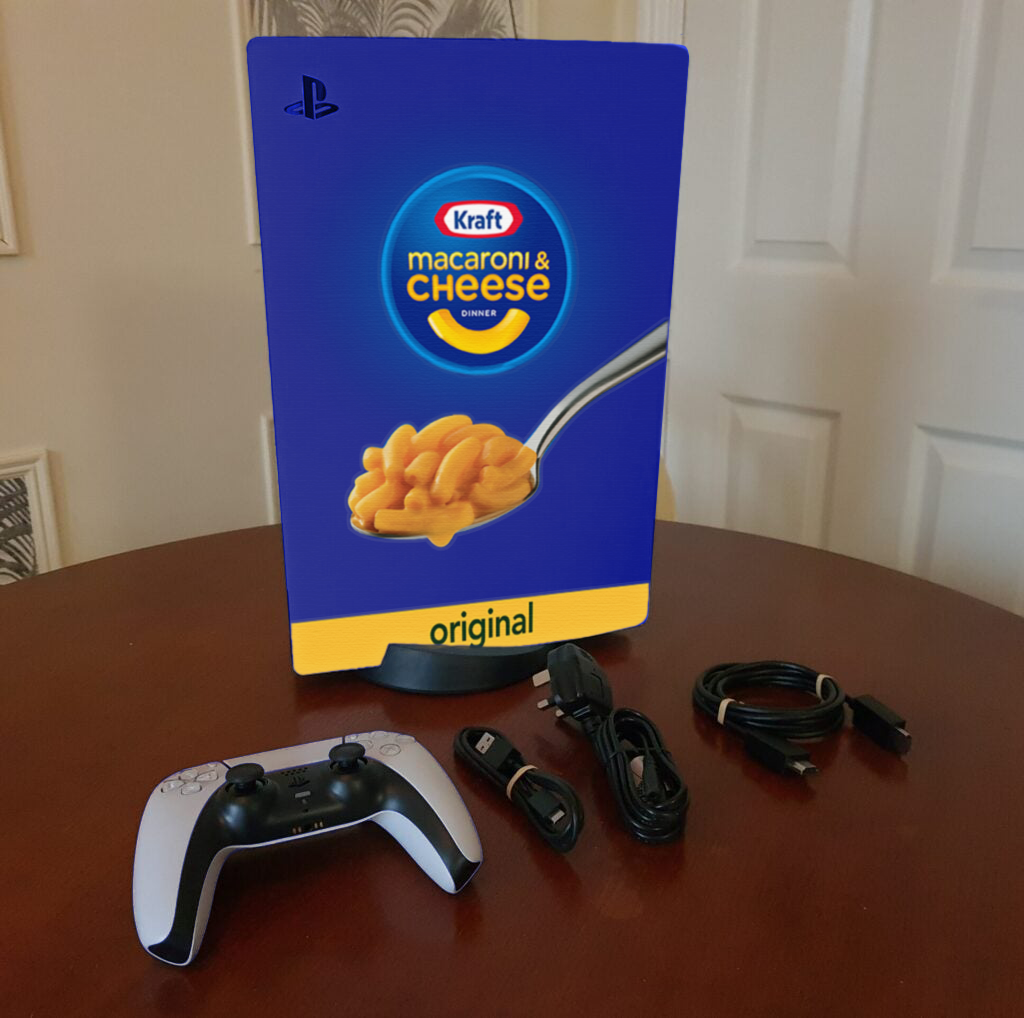
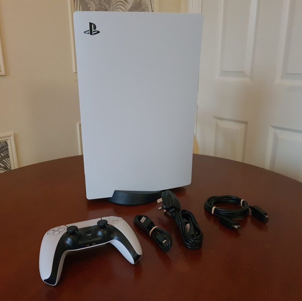
This week I was really inspired by how easy it was to throw realistic looking tattoos on a person, even if there was complex lighting and skin texture involved. I thought to myself “Huh, if it was so easy on skin, then I’ll bet it would be a breeze on textured plastic or something!”… Nope! It’s definitely not like that… at all.
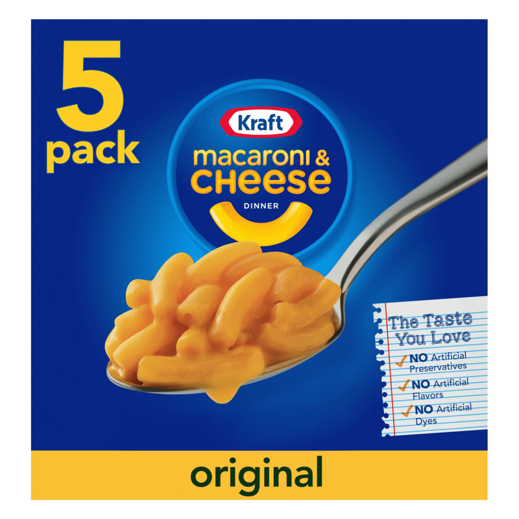
I thought I would be able to create some kind of viral photo… by making a strange collaboration between two companies, Playstation (Sony) and Kraft. I really don’t think the photo turned out. And I’m not sure how to make it look real?
“So why not submit a different assignment for Exhibit 09?” you might ask… well. I want to be able to come back and remaster this project. I want to learn how to do it right. I’m also pressed for time with the holidays upcoming and already spent… too long trying to do everything right with this photo. Anyway:
Contrast: I tried to make sure that the contrast stayed the same as the original image, just by changing the color to blue, and tweaking blending settings to let the light and shadows affect the graphic. I think one of the issues is that there aren’t any strong shadows, so nothing looks real. Maybe the original photo doesn’t even look real.
Repetition: I wanted to keep the branding consistent with how the Kraft mac n cheese appears on the box. I lifted those right from where they come from.
Alignment: I did have to do some liquify type stuff to make the graphics fit to the odd shape of the Playstation. Other than that, I wanted the graphics to be centered, like how they are on the Mac N Cheese boxes.
Proximity: On the boxes, the spoon and the logo are overlapping each other to save space. But here, I thought I would space them out slightly because they’re different dimensions than each other.
Font: I lifted the graphics right from a box of Kraft Mac N Cheese, so I didn’t have to use any fonts.
Color: I just wanted to stay on brand with Kraft, so I used their blue and lighter blue colors to give it an authentic vibe.