Breakout Films is my brothers YouTube channel. I’ve created his logo and text, made a limited edition logo specifically to be printed on T-Shirts, and am working on designs for a hat.
Design Breakdown
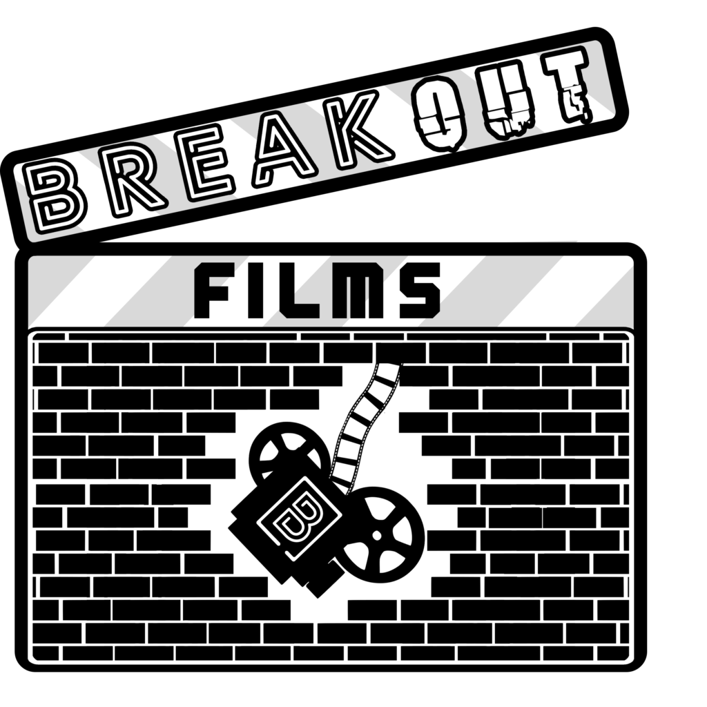
I wanted the original design to really push through and convey “BREAK OUT” because I thought it was a nice bold sentiment that would be easy to spring ideas from.
I created the main logo with the idea in mind of a old timey camera busting through a brick wall held by nothing but some film reels. I got working on that idea and it came together better than anticipated. I think that if in the future he wants an animated logo for his short film, it would be easy to find an animator to make the logo pop, because the design already has some storytelling with it.
The fonts I selected for the text I also wanted to convey a proper story. The “break” (Library 3 AM) looks like a maze of sorts, while the “out” (Breakaway) has a rugged, busted look akin to the broken bricks. I decided that “films” (BN Machine) would fit in if it was a more basic looking font with little detail, and I ended up going with this font that has a futuristic, neon vibe to it.
Because of the simplicity of the design in being black and white, I supplied him with white and black, or inverted, variants of all the designs.
Because it’s a YouTube channel, I made sure to include icons that would fit in profile pictures. With these, I added a “B” to further diversify the logo and accentuate the brand.
I came back and remixed the design for some limited edition T-Shirts that were handed out after the 50th video was published.