Exhibit 05
Old Work Remaster
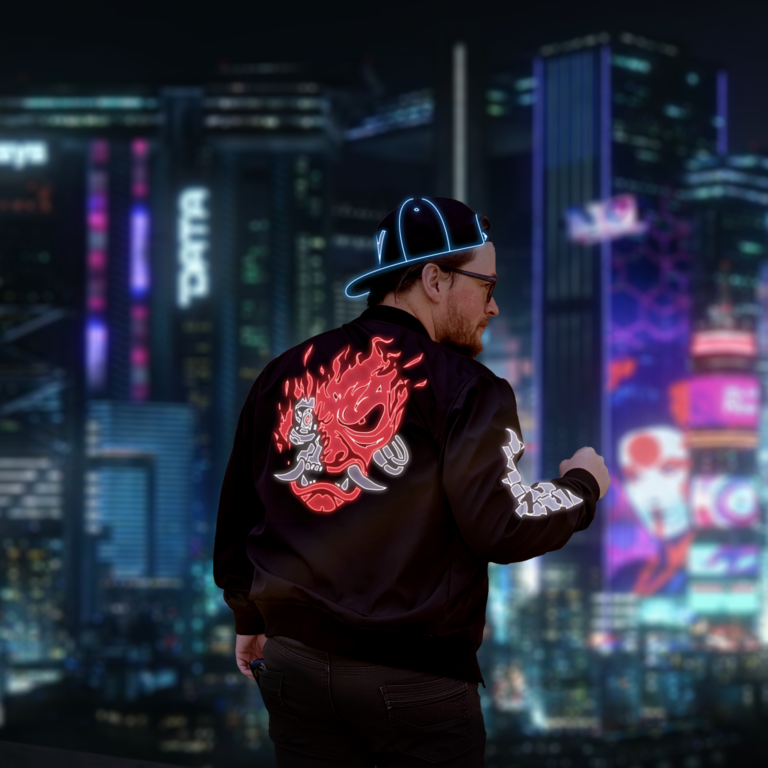
The new and improved version of the project that I corrected using an adjustment layer
Photoshop Design
For this project, we were instructed to use some adjustment layers to make an image, and I immediately knew what I had to do… I had to come and revisit one of my summer personal projects. I had more or less given up on it after I had a hard time making myself blend in with the background. I had learned a few tricks with the histogram, but I was doing them all wrong. After this week I had to come back, and boy, was I glad I did. It looks better than ever now.
Contrast: The original photo had too much contrast, and was very dark, so I knew that I had to use an adjustment layer in order to bring up the brightness to a point where it would match the background. The original photo was taken in broad daylight, which is what caused my original blight. But with some fine tweaks with some curves on the RGB, Red, Green, and Blue curves, I was able to come out with a result that looks a lot more convincing than just me in dark alleyway or on top of a dark rooftop. Changing the values of the curves really makes me seem more real. Like I belong in that world.
Repetition: When I was originally creating the image, I knew that there had to be a lot of neon. The background, and my jacket, are both from a franchise called Cyberpunk 2077, which as you can guess, takes place in the future. My hat, is one of my staple hats (I wear hats almost daily), and I thought, you know, it would really sell the image if I used a lot of neon in the clothing, and that would be consistent with some of the other character designs that they have for the world, and it would be much more striking than something that’s just flat. I think it came out great.
Alignment: Alignment was simple… I was going for a profile picture that I could use on all my socials, so I went with the idea that it was most likely going to be cropped into a circular shape, with me in the center, so I planned according to that. I made sure that my body takes up most of a circular cut, if I didn’t want to zoom in, but made sure the image was a high enough resolution that for sites like twitter where my profile picture is usually really small, I could zoom in and get some more details visible for those just scrolling past what I say on their timeline.
Proximity: I wanted to make sure that I stood out in front of the background, and I wanted it to look like I was actually there. So I put a gaussian blur on the background to the point where it looked like a natural blur you’d get in a camera if you were just focusing on me. In other regards, the neon was actually really complex to do and might be considered something to do with proximity… I went through with a pen tool and made a bunch of shape layers that followed the graphic on my back as best I could. In that way, I was keeping the proximity of the neon as close as possible to the edges of the original graphic so that I could more or less steal the natural look of how it is on my back in real life. I also kept proximity in mind when I was thinking about the margins of the image and where to align myself.
Font: No font choices here. If I were to use any sort of text, it would probably be the Cyberpunk 2077 logo, but even then, there wouldn’t be a font used. I love it just how it is, at any rate.
Color: Color is really interesting here, because I needed to make sure that I was dark enough to blend in, but light enough to tell that I’m a person (something the original clearly fails at). I also wanted to preserve the original colors of the jacket and the hat, but make them neon, so those are respectively just the colors that they were when I was wearing them. Made sure that the neon really popped when I put that outer glow layer on there. The background colors came with it when I downloaded it from a user who made a 4k version of some media materials that the Cyberpunk developers released. Link for that in the credits below.
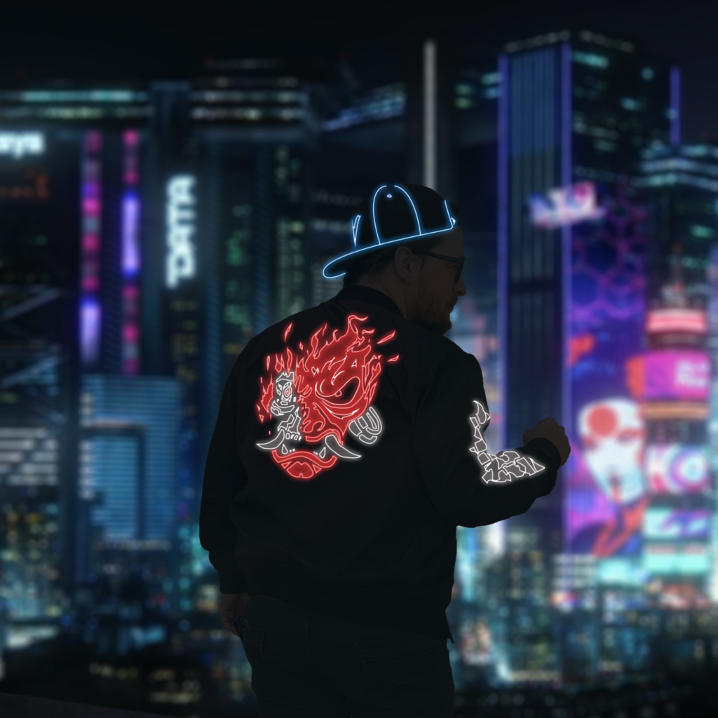
The old version of the project that I was unsure with how to fix, but still thought it looked cool enough to blast on all my social media’s anyway
Revisions
A mate suggested that, since I adjusted the exposure of the photo, to darken the pants to make me blend into the background more. So I came back and further revised it! Super pleased with how it turned out. Wonderful stuff.
Credits
Background image created (enhanced?) by u/Cookee_Cookz on Reddit (and is probably owned by CD Projekt Red)