Exhibit 08
Motivational Poster
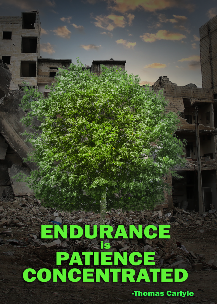
Final Product
Photoshop Design Breakdown
This project was influenced by the topics in the course this week, with the pen tool and saving path selections. I didn’t have a lot of ideas. This is what came to me first.
Contrast: I wanted the tree to really contrast the scene, a desolate, destroyed city. Light and darkness. Life and decay. That sort of thing. I went through two different trees, the other was a bit more spry, but both of them were difficult to see against the backdrop of the buildings? Which is why I opted for a vignette, to really highlight the tree. I also chose red text with a drop shadow to make it really pop.
Repetition: Down by the base of the tree, I cloned some rubble to make it seem as though it is sprouting from between the bricks.
Alignment: I wanted everything to be center aligned. The original background image is actually quite large which allowed me to have a lot of freedom with where I put the tree, so I decided where the tree would fit best and then I cropped it from there to fit this poster style.
Proximity: The text in particular I kept pretty close together.
Font: I used Franklin Gothic Heavy, and the reason for that is because it feels very reminiscent to me of those black border, motivational posters for some reason. At any rate, I also liked how bold and powerful it felt when I put the quote in all caps.
Color: Color was a bit tricky with this one. I really wanted the background to be quite bleak and then have the tree really pop out at ya. So I did some tweaking with the levels and curves to really accent that. Though, I didn’t think the sky fit. So I changed it out with the replace sky feature for something that was a bit softer that fit the tree a bit better. I used the red color in the font as somewhat of a direct opposition to the green of the tree. Red also does a great job of catching the eye, and is one of those power colors.
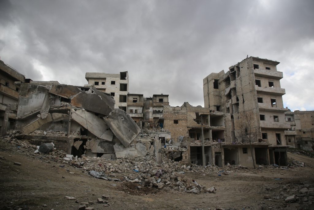
Original Background – courtesy of Kahled Akacha
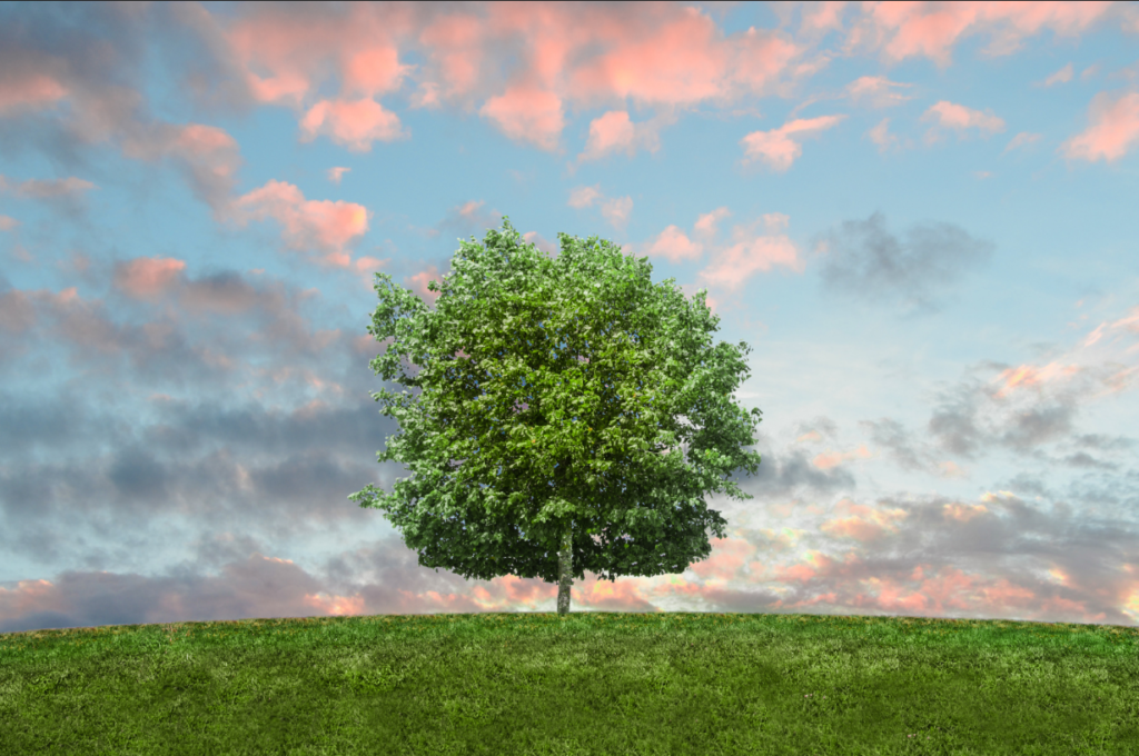
Original tree photo – courtesy of Yugal Srivastava
Revisions
In my original draft of this image, I had the tree a bit darker, the text as red, and “is” in all caps. Green was suggested to match the tree and also give a sense of living. The tree, since it’s the focal point, was brightened slightly to continue to convey it’s the focal point. Converting “is” into lowercase puts emphasis on all the words that matter most.
Credits
Font used is Franklin Gothic Heavy. Photos used are from Pexels, a free image sharing website, respective links to each photo listed above.