Exhibit 01
Motivational Display
Photoshop Design
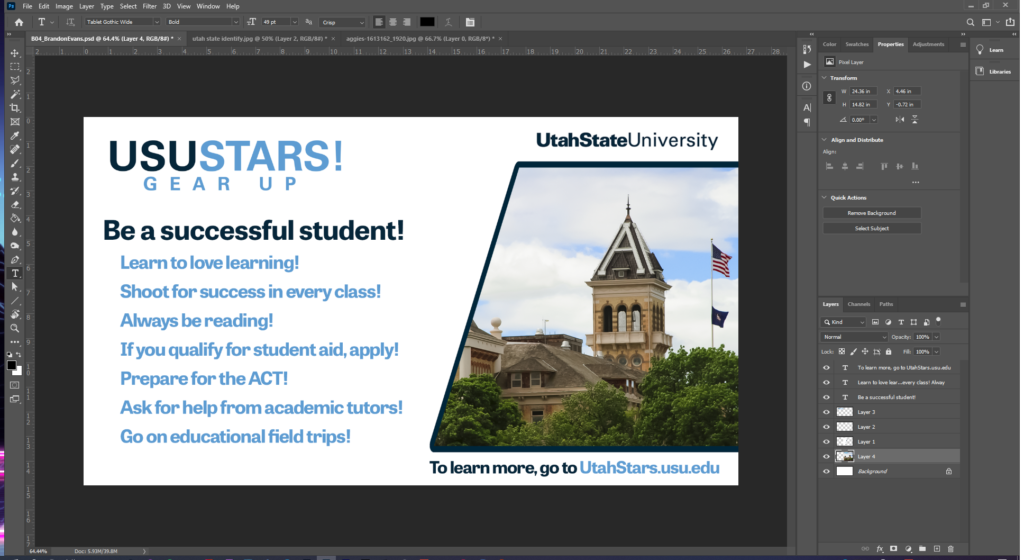
The idea for this design came from the inner recesses of my brain… I had imagined it being animated, as if swooping in from the side. Beyond that, I knew from the beginning I wanted it to be minimalistic and use only the colors from the USUSTARS logo. I began with the Web Large template, white background. From there, I used the polygon lasso tool in order to get the general shape of the image window. From there, I filled it in with white, then I inverted it, enlarged the selection, smoothed the selection, and then filled it in with the school navy color. From there, I just added in the image, threw a mask down, and added the logos and text.
Contrast: Contrast was easy to consider because the colors of the logo already contrasted each other. I am typically a “dark mode for everything” type of person, but the colors worked much better with the white background, and that allows them to maintain their branding. I thought that the image on the right would be a nice contrast of color to initially catch the eyes of passersby, as this would be something that would be up high on a television in a hallway.
Alignment: Because I knew from the start that I wanted it to follow my vision of a swoop shape, things had to be aligned to the opposite side of the image. I originally toyed with the idea of the image being on the left, but I found that it was easier to read and understand when the image was on the right. From there, I aligned the text so that it was almost like bullet points, beneath the phrase. I made sure the majority of the text was left align, with the exceptions being the text above and below the image, those being aligned with the image itself.
Proximity: I made sure that the statements below “Be a successful student” were positioned closely enough to that phrase so that they could be identified with it. I also color coded the section so that you know they’re all grouped together as a family unit.
Typography: I used Photoshops own match font tool in order to pull a font with a close enough resemblance to Utah State’s own font choice, so that the font I picked would be able to fit in with their established brand.
Camera Raw Editing
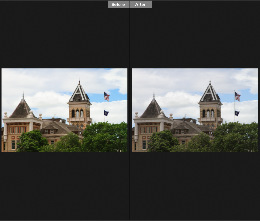
I went online and decided that the image definitely needed to be old main. So I googled old main and ticked on the creative commons filter, and found this image off of pixabay, which I then brought into camera raw in order to boost some of the colors, mainly the greens, blues, and some of the oranges (or tans of the building rather). I also did some detail work with reducing noise and sharpening, though those changes are very minimal and aren’t extremely noticeable. Also to note, the tags are backwards, the one on the left is the edit, the one on the right is the original.
Revisions
I updated the image so that the text all aligned with each other and overall had nicer feng shui to it.

Credits
Font: Tablet Gothic Wide, Pixabay image: https://pixabay.com/photos/aggies-utah-utah-state-university-1613162/


